

weight weenies kit?
-
weenie #2533

- Posts: 592
- Joined: Mon Apr 02, 2007 12:17 am
- Location: Serbia
- Contact:
that sounds cool!!

I'd definitely buy one of those!


Visit starbike.com Online Retailer for HighEnd cycling components
Great Prices ✓ Broad Selection ✓ Worldwide Delivery ✓
www.starbike.com

Any more info about the WW kit? I'm looking forward to ride with one of these!
*Light is beautiful*
BMC SLC01 5900g ... Litespeed Vortex 6300g ... Merida Carbon Lite 7000g ... Velocite Selene 8000g ... Argon18 E114 +/-8500g ... Trek 1500 9500g
BMC SLC01 5900g ... Litespeed Vortex 6300g ... Merida Carbon Lite 7000g ... Velocite Selene 8000g ... Argon18 E114 +/-8500g ... Trek 1500 9500g

I'm definitely in. But we need to do a bit more with the front, I think.
We could put the weenie on the front.... or would that be too goofy?

Also, I'd play with the option of black crotch area on the shorts. In the US, we're a bit more modest about such things, I fear. Call us inhibited.
Finally, whichever manufacturer is chosen, the stuff needs to be light.
Dan
P.S. Another vote for "< 6.8". Very cool. The UCI will probably lower the limit as soon as the jerseys are ready, though .
.
We could put the weenie on the front.... or would that be too goofy?
Also, I'd play with the option of black crotch area on the shorts. In the US, we're a bit more modest about such things, I fear. Call us inhibited.
Finally, whichever manufacturer is chosen, the stuff needs to be light.
Dan
P.S. Another vote for "< 6.8". Very cool. The UCI will probably lower the limit as soon as the jerseys are ready, though
IMO keeping it plain and simple would be ideal...
White of course, with "weight weenies" in weightweenies font across the front and back in black, and again round the collar in black, with perhaps some of the site sponsers logo ie fairwheelbikes and starbike.
White of course, with "weight weenies" in weightweenies font across the front and back in black, and again round the collar in black, with perhaps some of the site sponsers logo ie fairwheelbikes and starbike.
Here's my iteration on EuroTrash's design.

I don't have PCM nor can I run the previewer on my linux system, so can't generate the fancy preview he was able to do. But at least I can use the template files.
I don't have PCM nor can I run the previewer on my linux system, so can't generate the fancy preview he was able to do. But at least I can use the template files.

I kind of like that version actually, especially the Ti, C, and Al touches on the pockets.
My Lynskey R420 with Chorus 11
If you are interested in a Weight Weenies kit I no longer know what you should do.
If you are interested in a Weight Weenies kit I no longer know what you should do.
-
CoachPotatoBilly
- Posts: 375
- Joined: Tue May 13, 2008 12:21 am
- Location: Montgomery Village, MD
- Contact:
Szczuldo wrote:I kind of like that version actually, especially the Ti, C, and Al touches on the pockets.
+1 It all looks very very nice. I'd buy a kit for myself for sure if it looked like that. I like Dan's version the best by far.
Billy

I really like that design too, but is the colour set in stone? Im not exactly a fan of the orange but I love the design 
+1 with the inclusion of Ti, C and Al (not just because Im a science student)
PS
I know the orange is to match the logo, but I am not opposed to contrast and I dont think it would be a bad idea to have a little contrast. Or even black instead of the white...
+1 with the inclusion of Ti, C and Al (not just because Im a science student)
PS
I know the orange is to match the logo, but I am not opposed to contrast and I dont think it would be a bad idea to have a little contrast. Or even black instead of the white...
a riddle wrapped in an enigma wrapped in lycra
Life is like riding a bicycle - in order to keep your balance, you must keep moving.
Albert Einstein
Life is like riding a bicycle - in order to keep your balance, you must keep moving.
Albert Einstein
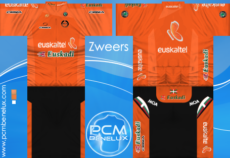
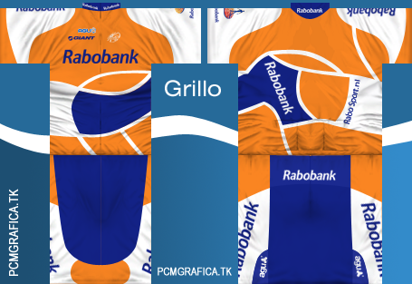
If the design is to be orange-based, the obvious examples are Euskatel and Rabobank (jerseys from PCM collection)
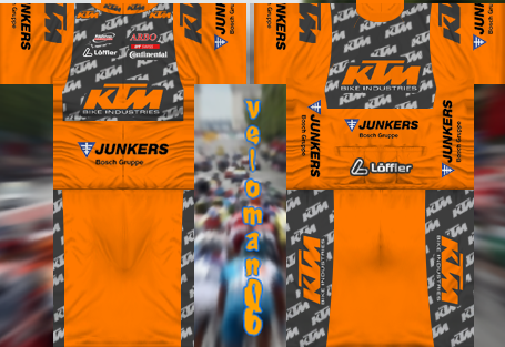
KTM:
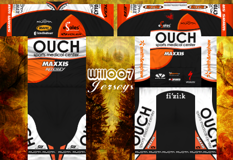
Also, Ouch-Maxxis is a bit orangy:
But another option would be the carbon fiber motif.... sort of goofy at this point:
KTM:
Also, Ouch-Maxxis is a bit orangy:
But another option would be the carbon fiber motif.... sort of goofy at this point:


Thanks for the positive feedback! I think the point about contrast was a good one, so I worked on that. Changing the sidepanels to white reduces the orange overload, as well. I played with different colors to complement the weenie, but nothing worked for me. I put the Gimp source here in case anyone else wants to play.

changed: I made each "W" a double-W.
changed: I made each "W" a double-W.
Last edited by djconnel on Sat Aug 22, 2009 9:50 pm, edited 1 time in total.
The change to the side panels works well, it accentuate the orange "W" on the front and back which is something I liked a lot in your original design, the weenie on the shorts (that sounds horrible) is also a nice touch.
Classy kit.
Classy kit.
Yeah -- WRT the weenie. I tried filling it in down to the bottom of the jersey, but that had serious, errr... issues. Who came up with the "mascot", anyway? It's an ant, sure, but...
Last edited by djconnel on Sat Aug 22, 2009 9:54 pm, edited 1 time in total.
Visit starbike.com Online Retailer for HighEnd cycling components
Great Prices ✓ Broad Selection ✓ Worldwide Delivery ✓
www.starbike.com


