Insane bike ,,check it out

Back by popular demand, the general all-things Road forum!

Moderator: robbosmans

xena
Banned
Posts: 1149
Joined: Tue Apr 15, 2014 9:49 pm

by xena

This is one a many bikes that my friend Ed who runs http://tsubasabicycles.com/takhion-tsubasa-mass has made.

http://londoncarbonrepairs.co.uk/

This bike is insane and Ed believes in a good cause. Ed worked with Olympic gold winning frame designer Takhion. Check the Tsubasabicycles site for frame details

Image


Image
Xena a demi god among the digital demimonde that is WW community

http://i.imgur.com/hL5v3ai.jpg

https://www.flickr.com/photos/131970499@N02/

User avatar
prendrefeu
Posts: 8580
Joined: Wed Oct 31, 2007 10:32 pm
Location: Glendale / Los Angeles, California
Contact:

by prendrefeu

Love the concept!!
Slick graphics and marketing concept overall for Ed/Tsubasa (although I do have criticism over the typography which needs more effort and consideration).

But, to be fair, round tubes ≠ aero. Having a small surface area into the wind certainly helps, but it's the shape that factors most into aero qualities, namely how the air travels around and after the shape (its wake).

The concept is interesting though! Great work.
Exp001 || Other projects in the works.

by Weenie


Visit starbike.com Online Retailer for HighEnd cycling components
Great Prices ✓    Broad Selection ✓    Worldwide Delivery ✓

www.starbike.com


User avatar
DMF
Posts: 1062
Joined: Sat Dec 06, 2008 10:14 am
Location: Sweden

by DMF

Seems familiar...

Image

jooo
Posts: 1510
Joined: Wed Feb 02, 2011 3:48 am

by jooo

Sorry to sound like a hater, but this needs more work IMO. The idea isn't bad, but the execution misses the mark. It irks me that the handlebars don't point in the right direction and that the surface finish (especially on the chainstays) looks quite poor.

xena
Banned
Posts: 1149
Joined: Tue Apr 15, 2014 9:49 pm

by xena

prendrefeu wrote:Love the concept!!
Slick graphics and marketing concept overall for Ed/Tsubasa (although I do have criticism over the typography which needs more effort and consideration).

But, to be fair, round tubes ≠ aero. Having a small surface area into the wind certainly helps, but it's the shape that factors most into aero qualities, namely how the air travels around and after the shape (its wake).

The concept is interesting though! Great work.


"although I do have criticism over the typography which needs more effort and consideration" In your opinion Prendy.

Logo's are personal design.

Although I enjoyed your bike when you posted it I did not comment on your decal design. You obviously like it but its not my cup of tea and I have enough respect for you not to mention that fact when you posted your bike.

Did you look at the link and check what this bike is all about ? And who Ed worked with?
Xena a demi god among the digital demimonde that is WW community

http://i.imgur.com/hL5v3ai.jpg

https://www.flickr.com/photos/131970499@N02/

xena
Banned
Posts: 1149
Joined: Tue Apr 15, 2014 9:49 pm

by xena

jooo wrote:Sorry to sound like a hater, but this needs more work IMO. The idea isn't bad, but the execution misses the mark. It irks me that the handlebars don't point in the right direction and that the surface finish (especially on the chainstays) looks quite poor.


The handle bars are completely Straight . The finish is designed for purpose and weight.
Did you look at the link? I doubt it . because if you think the handle bars are not straight you need to.
Ed worked with a legendary bike builder who designed bikes that won Olympic gold.

If you tell me your favourite colour, next time I'm over at one of Ed's workshops I will ask him to spray it and finish it so it looks all nice and commercially and pleasing to your eye :roll:
Xena a demi god among the digital demimonde that is WW community

http://i.imgur.com/hL5v3ai.jpg

https://www.flickr.com/photos/131970499@N02/

XCProMD
Posts: 1128
Joined: Sat Jan 26, 2008 10:25 am
Location: Cantabria

by XCProMD

DMF, how could it possibly look unfamiliar if the bike itself claims to be a tribute to Takhion?

hornedfrog
Posts: 235
Joined: Tue Feb 28, 2012 9:13 pm

by hornedfrog

Whoa, someone is taking this wayyyyyy to personal.

Typography and logo's are two very different things. While logos are unique to the individual or company and can be whatever the heck someone wants them to be, typography, like any art form, has a general set of guidelines. So no, prendrefeu does have a right to criticize, (and if my memory serves me right, I believe he makes a living as a designer) so chill.

Re jooo, what I think he means is that yes the tubes themselves are straight, but in relation to the top tube, they are not parallel. He claims they help maximize aerodynamic, but I think it is just that, a claim. I'll leave all the nonsense aero talk to the ViAS thred, but there is a lot of exposed bar that would not fair well for aerodynamics. Also, grabbing on to those bars would be killer on the wrists.

As far as the finish goes, especially along the chainstays, you can clearly see many creases and folds in the layup. That is not a cosmetic defect, but a structural inconsistency. Winkles and folds in a carbon layup is a huge no no.

While I get what he is going for in some of his other designs, the majority his layups "look" half assed.

hornedfrog
Posts: 235
Joined: Tue Feb 28, 2012 9:13 pm

by hornedfrog

And surface finish looks weird because it is just sanded, no clear coat. Nothing wrong with that, just meh.

User avatar
ergott
Posts: 2870
Joined: Tue Apr 18, 2006 3:03 am
Location: Islip, NY
Contact:

by ergott

Looks like money raised is going to a good cause. That bike isn't something that should be raced on the velodrome. First of all, yes the bars are straight, but they point the wrong way for any sort of real leverage on the bars. The hand position of the original wasn't replicated at all. Even in the picture the hands aren't at the ends of the bars. Why are they so long? What's the point of being weight conscious with bars out there like that?

I can't comment with confidence on the carbon layup, but it sure doesn't like the one-off work I've seen from other, more experienced carbon builders.

xena, it's clear you have an emotionally vested interest in the bike and like I said, I hope it raises a lot of money for a good cause. That said, I find it hard to believe it's any more than an art piece.

DanW
Posts: 1244
Joined: Fri May 02, 2008 5:39 pm
Location: Here, there and everywhere

by DanW

Certainly a thing of beauty from the pic

The finish on the items on the carbon repair site leaves a lot to be desired though, however structurally sound it might be.

User avatar
prendrefeu
Posts: 8580
Joined: Wed Oct 31, 2007 10:32 pm
Location: Glendale / Los Angeles, California
Contact:

by prendrefeu

xena wrote: "although I do have criticism over the typography which needs more effort and consideration" In your opinion Prendy.

Logo's are personal design.

Although I enjoyed your bike when you posted it I did not comment on your decal design. You obviously like it but its not my cup of tea and I have enough respect for you not to mention that fact when you posted your bike.

Did you look at the link and check what this bike is all about ? And who Ed worked with?


Hi. As hornedfrog pointed out, I make my living as a designer. I've been doing graphics for several decades now, although my true passion is in architectural design and product design (I'm trained as an architect). That said, I'm highly sought after for my typographic design and layout work.

Logos, while they can be purely in the form of text (hence "logotype"), are a matter of personal opinion. I did not criticize your friend's logo.
What I did criticize, however, is the typography. Here is a link to a basic definition of typography.

Yes, I did look at the link and read all about what the bike is about, in fact I'll reference it below. I looked at the pictures of your friend pretending to work on the bike while images of his 'inspiration' over the Ukraine are projected on a back wall and your friend is looking artistically moody. That's fine, it's the aesthetic he's going for and all the best to him. No criticisms there. The criticism is in the typography, ok?

Here are the basics:
-Body text is originally designed for titles or short (1-2 lines) text. Using it as a body is a poor choice. It would be a good idea to have whoever designed that (someone did...right? or did Emma just write it? Who did the typography?) choose 2 fonts, one for titles and pull outs, the other for body. Weights and colors can vary from there. It is a rare, rare skill to have both body and title work together well. It isn't working here. If a person wants to do only use one font throughout here are few well known (ie, most people have heard of them) options which work: Times New Roman, Helvetica Neue, Garamond. But again, vary your weights if you're doing this or be very, very, very good about your spacing elements.
-Body text should be a lower weight. Drop all ligatures. In the case that no ligatures were used (really hard to tell, frankly, because the font isn't meant to be used with such large body), change kerning for better clarity.
-Leading needs improvement. Increase it by a few .5 or 1 em.
-Singular quotation marks instead of doubles... why?! Use doubles, unless the quotes (example, page 9) are referencing something said by another and not a quote itself.
-Considering the layout of images in the slideshow, the shape of the object and the use of a very geometric, non-humanist font the designer chose, a full left-aligned-full-justification would have been better in the body.

Overall graphics: since it's a slideshow it would have been nice to see some consistency in the dimensions of the images and their layouts in the slides. Considering frames are engineered, and a lot of thought was put into the bike, so too should its presentation be engineered and precise.


There you go. That's criticism of typography. It isn't about the logo. The bike is what it is, and the money went to a good cause. And, again, go back and read the first post I wrote to see specifically what I wrote. Thanks.
Exp001 || Other projects in the works.

xena
Banned
Posts: 1149
Joined: Tue Apr 15, 2014 9:49 pm

by xena

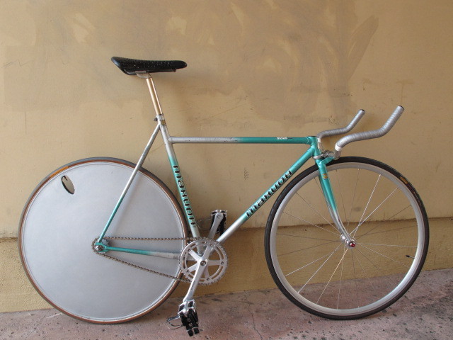
DanW wrote:Certainly a thing of beauty from the pic

The finish on the items on the carbon repair site leaves a lot to be desired though, however structurally sound it might be.


You are being shown the repair that Ed does not a sprayed and coated finish..
Xena a demi god among the digital demimonde that is WW community

http://i.imgur.com/hL5v3ai.jpg

https://www.flickr.com/photos/131970499@N02/

xena
Banned
Posts: 1149
Joined: Tue Apr 15, 2014 9:49 pm

by xena

Prendy
We are all critics. Artistic freedom should never be bounded or you never get innovation or new creation. Stick to formula. stick to being boring. I can play most musical instruments I play the guitar very well, I can play anything from Vai to Prince from jazz to indie.
There is no right. If it sounds good it's good. If it looks good it looks good. We can all be critics but you have to learn to let go of your skill sometimes and see things for what they are not what you think they should be. Its art, there is no right or wrong. If you think there is, then design no longer becomes art as a creative process because you are restricted by "The basics ,the norm the same starting point" "you should always do this" So you end up with a variation of the same foundations. Its just a logo that IMO sits very well in the design. Typography and all. Thanks very much.
Create innovate


As for the lay up folds etc etc, that is not a issue. I have seen the bike many times and it is beautiful "raw". Ed has developed some of his own carbon [ own patent] and what you are seeing is innovation and creativity. If he wanted it to look all nice and shiny and smooth he could have.
Xena a demi god among the digital demimonde that is WW community

http://i.imgur.com/hL5v3ai.jpg

https://www.flickr.com/photos/131970499@N02/

by Weenie


Visit starbike.com Online Retailer for HighEnd cycling components
Great Prices ✓    Broad Selection ✓    Worldwide Delivery ✓

www.starbike.com


User avatar
prendrefeu
Posts: 8580
Joined: Wed Oct 31, 2007 10:32 pm
Location: Glendale / Los Angeles, California
Contact:

by prendrefeu

Wow....

Either you still don't get it, Ray, or you're a really good troll. If the latter, congratulations I guess.

Image

The congratulations and applause to your friend has already been posted, but apparently you're too blinded by personal agenda to see that as well.
Exp001 || Other projects in the works.

Post Reply