The NEW Weight Weenie Kit Thread

Questions about bike hire abroad and everything light bike related. No off-topic chat please

Moderators: robbosmans, Moderator Team

Post Reply

Clothing manufacturers

Louis Garneau
40
51%
Pactimo
8
10%
Champion System
31
39%
 
Total votes: 79

User avatar
eurperg
Posts: 938
Joined: Mon May 14, 2007 10:32 am
Location: Finland

by eurperg

Liggero wrote:A very important thing for kit designs:

- the more colours you use, the more expensive it gets. Right now this kit has four colours, and then the ones needed for the ant. I think that is too much. 4 colours/tints is a good maximum, therefore I would make the ant face logo monochrome, or jsut with a white or grey texture fill.


Sublimation printers create all colors using CMYK colors, and even fluorescent colors can be printed with extra cartidges at the same time with minumal extra cost, because inkjets hold usually 8 cartidges at the same time. What you're saying was probably true before digital printing...

I would still simplify the design a lot, and get rid of the mascot...

Btw, I have designed some kits and cycling club identitities too, here and here

User avatar
Liggero
Posts: 955
Joined: Sat Feb 18, 2012 11:49 pm
Location: Netherlands

by Liggero

eurperg wrote:
Liggero wrote:A very important thing for kit designs:

- the more colours you use, the more expensive it gets. Right now this kit has four colours, and then the ones needed for the ant. I think that is too much. 4 colours/tints is a good maximum, therefore I would make the ant face logo monochrome, or jsut with a white or grey texture fill.


Sublimation printers create all colors using CMYK colors, and even fluorescent colors can be printed with extra cartidges at the same time with minumal extra cost, because inkjets hold usually 8 cartidges at the same time. What you're saying was probably true before digital printing...

I would still simplify the design a lot, and get rid of the mascot...

Btw, I have designed some kits and cycling club identitities too, here and here


Very good input, and very good kit you designed, I like those a lot. A bit too dark, I would put some white in, but overall much better than the ones proposed in this thread.
Happy Trails !!!

by Weenie


Visit starbike.com Online Retailer for HighEnd cycling components
Great Prices ✓    Broad Selection ✓    Worldwide Delivery ✓

www.starbike.com


User avatar
prendrefeu
Posts: 8580
Joined: Wed Oct 31, 2007 10:32 pm
Location: Glendale / Los Angeles, California
Contact:

by prendrefeu

Image
Exp001 || Other projects in the works.

Asymptotic
Posts: 253
Joined: Mon Jul 11, 2011 11:06 am
Location: North Adelaide, South Australia

by Asymptotic

^ lol, very apt. Could have at least acknowledged your professional time given away for free.
Norwood & Adelaide Uni CC

User avatar
slyboots
Posts: 444
Joined: Sun May 10, 2009 3:31 pm
Location: Russia, Moscow

by slyboots

I like the blue-black-green one as well. Thanks for your effort, prendrefeu!

kevinkalis
Posts: 553
Joined: Tue Aug 03, 2010 6:29 pm

by kevinkalis

Here's another vote for prendrefeu's first design and, also, going with Capo instead of LG.
K2

Do you suffer more when you train, or cannot train?

User avatar
djconnel
Posts: 7917
Joined: Wed Sep 26, 2007 1:57 pm
Location: San Francisco, CA
Contact:

by djconnel

I like the revision more than the first two.

One of the issues on evaluating jersey designs is to establish what the goals are. If it's just to match your bike, if you don't want the logo to get in the way, go with Rapha instead. But my view is the point of this jersey is to promote Weight Weenies, and to advertise the rider as a fan of the forum. It should be distinct and reflect the design of the forum to some degree, and the weight weenies aspect should show up in photos from any angle. That was the philosophy I used. If you just say "it's ugly", well I lived with the constraints of the web site. The "weight weenies" text, for example, is a bit cumbersome, but it is what it is. That had to be there. But at least I tried to avoid stacking it, because it doesn't stack well, so I tried things like splitting it between the short and jersey side panels, which I don't think I've seen done much if at all.

This one reflects the web site fairly well. I'd definitely buy it. I didn't like the first of the two initial P designs as much and I wasn't sure on that one.

I'd consider changing the shoulder text to more of the form I used because I think it uses the raglan cut a bit better and I'm not sure the stacked text will look good there. I used the Pro Cycling Manager jersey template and previewer to project my design onto a moving 3-D model. But maybe this will work. I entered a competition for my team's kit design and lost. I thought the winning design wouldn't work, but when I saw it in person, I was wrong. It's hard to judge how things will look live. This might well work fine.

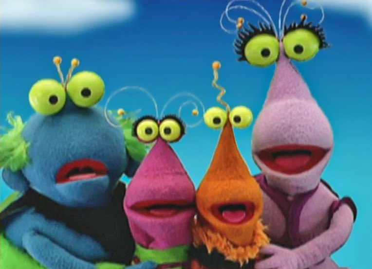
On the low-res versus high-res mascot: either is fine. In any case, the mascot is borrowed from Jim Henson, so perhaps the low-res one is more obviously not a Twiddlebug. But my initial concern was people might not get that it's intentional and assume it's due to poor design.
Image

User avatar
PSM
Posts: 1706
Joined: Tue Aug 28, 2012 2:45 pm
Location: Stockholm, The Arctic...

by PSM

I am "buying" the jersey thanks to the mascot. It is fun.

No mascot. No jersey. :|

User avatar
Liggero
Posts: 955
Joined: Sat Feb 18, 2012 11:49 pm
Location: Netherlands

by Liggero

I believe that "design by committe" is the way to go. Long life to democracy!!!!
Happy Trails !!!

AGW
Posts: 477
Joined: Sun May 27, 2012 2:11 pm

by AGW

But democracy isn't unanimous... We have a serious case of tyranny of the minority here.

User avatar
Liggero
Posts: 955
Joined: Sat Feb 18, 2012 11:49 pm
Location: Netherlands

by Liggero

AGW wrote:But democracy isn't unanimous... We have a serious case of tyranny of the minority here.


I was been sarcastic but anyways... Unanimous is quite utopian, specially in the case of a kit design. Considering how things are going, I don't think i would ever buy this kit, so you can already get my opinion and throw it to the trash. You can use the design inputs if you want though, but as in any democracy, the good things go to the trash too. Tyranny of a minority is not democratic, sound more like a dictatorial thing. Otherwise make another pool for the design and problem solved.

More in cycling kits designs:

http://youtu.be/wlaI8oceQwA" onclick="window.open(this.href);return false;
Happy Trails !!!

kevinkalis
Posts: 553
Joined: Tue Aug 03, 2010 6:29 pm

by kevinkalis

The worst thing possible would be trying to satisfy everyone with a design, it's never going to happen.

I say we should nominate one or two persons to handle the designs, then release a poll of 2 or 3 designs for everyone to decide which they like best.
K2

Do you suffer more when you train, or cannot train?

User avatar
PSM
Posts: 1706
Joined: Tue Aug 28, 2012 2:45 pm
Location: Stockholm, The Arctic...

by PSM

Love it:

Image

Maybe another colour? ;)

User avatar
Szczuldo
Posts: 561
Joined: Tue Aug 12, 2008 2:22 pm
Location: Salt Lake City, UT

by Szczuldo

I haven't been checking the forums often and I am still not getting email notifications of responses for whatever reason. :/

As for the kit. From a won't match your bike standpoint, the green I think stands out a lot more than the orange we last used. The jersey design was great and most importantly original. Since Liggero was able to link to to a kit that looks very similar I think we need more work on the design if it is going to change. The 'W' shape on the jersey really tied everything together. Right now the sharp angles and diagonal lines really are not bringing anything but distractions.

The things I like about Prendrefue's design are the 'lighten up' text, the periodic table of element squares for the frame materials, and the weenie out of the pocket. Personally I really liked our original weenie out of your butt design since it would be a great conversation piece for those riding behind you. Also looking back I like the design using orange instead of green (and usually I am a big fan of green.) The shorts design from the original could use some work and prendrefue's idea with some more work could be the ticket.

So the key points would be:

-The orange color really need to stay.
-Weight Weenies is not the same without the weenie.
-Overall design of the jersey needs to tie everything together. Random lines to make it look 'modern' and similar to some of the pro kits distracts the eye.
-The shorts need to tie in with the jersey, our current shorts just barely get by on that count. So a redesign of those could be in order.

Liggero wrote:If I were you, I would ask Prendrefeu to do a decent design. If you charge 5€ extra per kit, considering a decent kit will sell 5-10 times more than this one, you can pay the designer and you'll get a decent design. And yes, it will cost you about 5€ per person; what a wrong idea I just had, right? Shame on me...


Now I'm not trying to light the fire again but I am putting in as much if not more work into this than someone who designed the kit. I am not asking for any compensation for this so why should another member of the weight weenies community? DJ did not ask for any compensation last time, nor did I. I don't care if you are or are not a graphic designer, I think it is extremely selfish of you to try to profit on a community project. Provide your services if you desire, or mock up some proofs and then, maybe then could we as a community decide to pay you for your services or not. It is not my decision to make everyone pay an extra 5€.
My Lynskey R420 with Chorus 11

If you are interested in a Weight Weenies kit I no longer know what you should do.

by Weenie


Visit starbike.com Online Retailer for HighEnd cycling components
Great Prices ✓    Broad Selection ✓    Worldwide Delivery ✓

www.starbike.com


User avatar
PSM
Posts: 1706
Joined: Tue Aug 28, 2012 2:45 pm
Location: Stockholm, The Arctic...

by PSM

Image

Image

Image

Image

Post Reply